
Label
It refers to the text label. As annotators of features are displayed on the map, users can recognize the information easier and get the layer information. Label is to mark the attribute values of a specified field on the map for users to recognize. So, as users see the features, they can know the attribute values through the label, or even find out the position of feature by the labeled attribute value.
For instance, let's take Taipei City districts for example. If you want to mark the district names on each district for users' easier understanding of the district's name and position, the label function can be used to achieve the goal. So, you will see the administrative districts with name shown on the map.
1.First of all, enter Layer Properties, tap the Label tab,entering the “Label” dialog box.
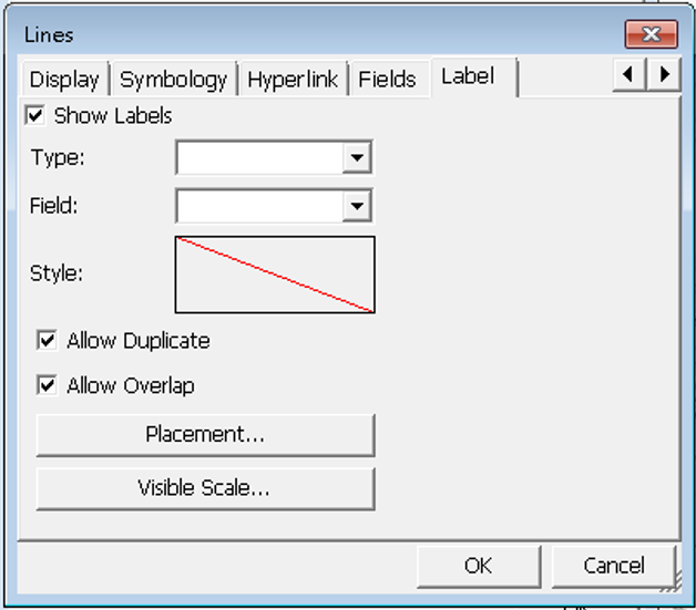
2.In the next, check Show Label and set up the following items:
Type: two options, Simple and Line. What should be noted is that you can select Simple for point, line or polygon layer, but can only select Line for Line Layer. Line is not available for point or polygon layer. Why does line layer have a particular line type to choose? This is because in line layer the text of label can be divided into along line or not, repeated text or not and the problem of orientation of text position, which is more complex and needs to do special treatment. If you select Line type for the line layer, the Placement item will offer different contents from selecting Simple type. Later in the Placement part we will respectively explain the options provided for selection of Simple and Line, and now we take Simple as the example.
Field: to specify the field to mark label.
Style: tap Text Symbol entering “Text Symbol” dialog box. Here you can set up Font, Color and whether to display Shadow and Halo effect.
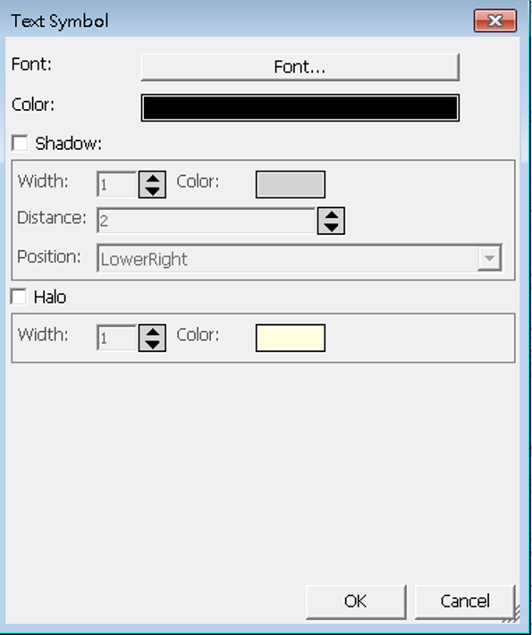
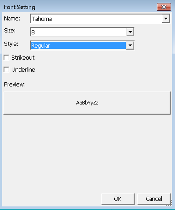
3.To set up font, please tap Font, and enter “Font Setting” dialog box.
4.Tap the drop-down arrow of Name, Size and Style to set the name, size and style of the font by each. Style includes four styles of regular, bold, italic and bold italic for your options. Besides, you can choose whether to use Strikeout and Underline effect. If the Strikeout effect is checked, the strikeout effect preview will display in the square below.
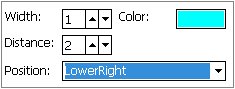
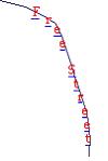
5.If you want to set Shadow effect, please check Shadow item and set up Width, Color, Distance and Position.
Width: width of the shadow.
Color: color of the shadow.
Distance: the distance from the shadow to text.
Position: the relative position of shadow to text.
![]()
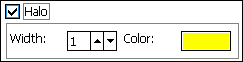
6.If you want to set up Halo effect, please check the Halo item and set the Width and Color. What is halo effect? It is to spread out a color zone with some width to enhance the visual effect from the edge of the text, just like circling the text with a color zone and extent slightly outwards, such as ![]() . The yellow zone is the halo effect display. After all settings are finished, please tap OK and back to the Label page to preview the display with the settings. If you want to adjust, tap Text Symbol again to modify.
. The yellow zone is the halo effect display. After all settings are finished, please tap OK and back to the Label page to preview the display with the settings. If you want to adjust, tap Text Symbol again to modify.
![]()
7.Placement: the label can be divided into two kinds, for line layers only and for layers of all types of layers. Putting the line layer from the other groups is because in line layer the text can be placed along line or not, repeated text or not and the orientation of text position to the line, which is more complex and needs to do special treatment. However, the layers of the other types need to consider the text layout only. For example, place the text to the center, right, or left to the feature? Or the system can set the various combinations. For example, if the setting orders are set as center priority and up the second, the system will place the labels to the center in top priority. If the center layout will be deterred by something, the system will use the second order setting. In conclusion, system will follow the placement orders to place the text. Besides, line layer and layers of other types both can set the label's maximum and minimum visible scale so that the layer will not be massive due to too many texts on the map. With the visible scale setting, the map looks more comfortable, neatly and easy to read. No matter you choose Simple type for a point, line or polygon layer, when you tap Placement, it shows the identical “Placement” dialog box. Please check the desired placements first, then tap![]() or
or ![]() to arrange the order.
to arrange the order.
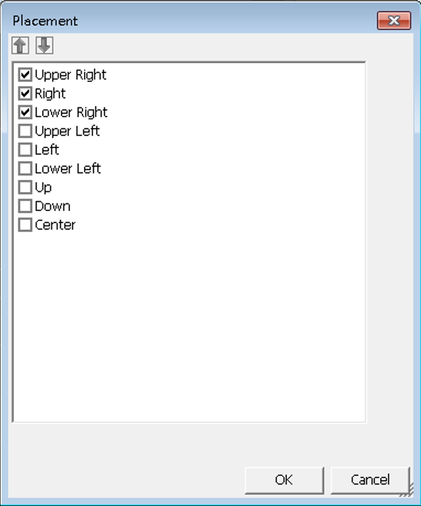
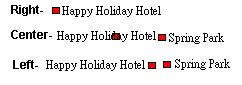
For instance, the priority orders set Right, Center and Left, referring that the text will be placed according to the priority of right, center and left. If the text will be deterred as placement to the right, system will adjust the placement to the second order-center; if the placement in center also gets deterred, it will be placed to the third-order- to the left.
8.If you choose Line type, as tapping the Placement, “Line Feature Annotator” dialog box appears. There is one item to set:
Along: two options, By Word and By Character. Along is used to set whether the text is to display along the line feature or according to the text's original type.
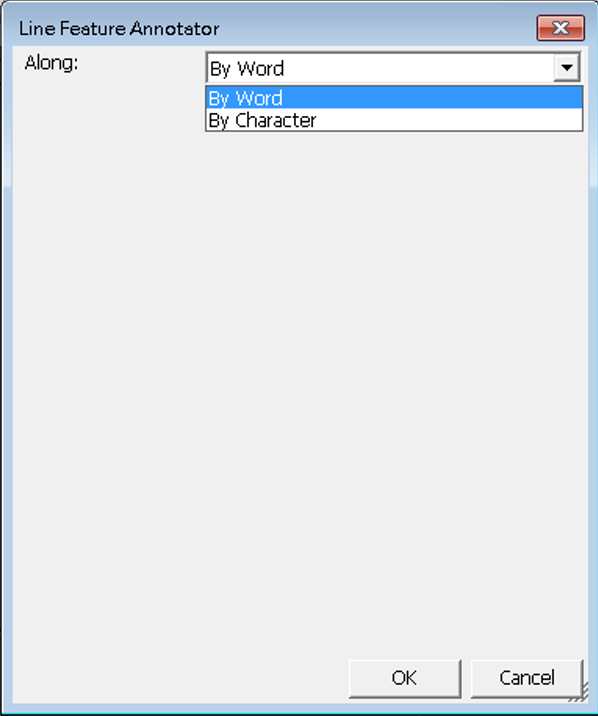
By word means each character of the text is along a line.

While By Character refers each character is along the line feature.
9.Visible Scale: you can set the visible scale “as layer's visible scale” or “when zoomed between.” The use of label can give more information, enriching the map with higher value. However, under some situations the labels might interfere the map reading. For instance, when you are viewing the global rainfall distribution, it is unnecessary to mark Taiwan administrative district names on the map, which is of little thematic map meaning and troubles readers instead.
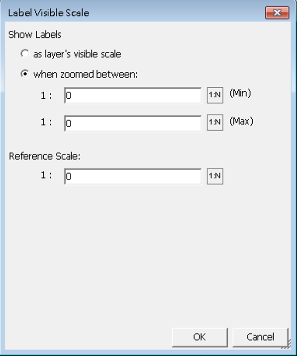
10.The reference scale can display the label at a specific scale ratio. When the map is zoomed in, the label will become larger accordingly; when the map is zoomed out, it becomes smaller. You can tap ![]() to acquire the current map scale and set it the reference scale. If the reference scale is not defined, the label will be displayed at a fixed scale, which means the label displays in fixed size no matter the map is zoomed in or out; If reference scale is defined, when map is zoomed in or out, the label will also be zoomed in or out according to the reference scale.
to acquire the current map scale and set it the reference scale. If the reference scale is not defined, the label will be displayed at a fixed scale, which means the label displays in fixed size no matter the map is zoomed in or out; If reference scale is defined, when map is zoomed in or out, the label will also be zoomed in or out according to the reference scale.
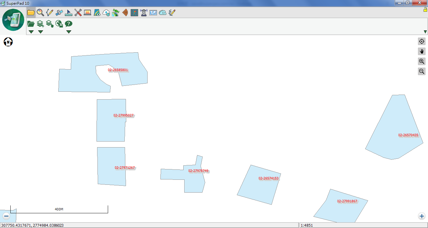
About “when zoomed between”, if the minimum scale is set 1:7,000,000, and maximum 1:430,000. After settings are finished, tap OK in each dialog and back to the map window. In figure below, you can see the scale at the lower right corner is between the set scales as 1:445,048. As a result, the labels are displayed.
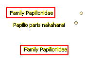
11.Allow Duplicate: if you choose to allow duplicate, please check it; if not, please uncheck it. Sometimes too many labels duplication makes the map layout massive and uneasy to recognize. See the figure below, so one label appears once only, allowing the layout looks more neat and comfortable.
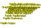
12.Allow Overlap: if you choose to allow overlap, please check it; if not, please uncheck it. The annotators might overlap due to the close distance to each other, resulting in unidentified text and massive look; in such situations, we suggest you uncheck Allow Overlap.
13.If you consider presenting label messages completely, you can set up Allow Overlap function as figure below. If the overlapping causes the unidentified text, we suggest you to zoom in the map display. So, the label will be clearer. Or you can set up the label's visible scale based on the most comfortable visual effect, which will show the labels when map is zoomed between the maximum and minimum values you set. Therefore the map looks good and is able to offer sufficient information.
© 2017 Supergeo Technologies Inc. All Rights Reserved.