
Chart Types
Appropriate graphs might be the easiest way to figure out the information. Using graph is another way to present the features on the map so that users may compare and contrast the attribute data of the features and recognize the changes or trends in the data. SuperGIS Desktop Graph tool has 6 built-in graph types, including Vertical/Horizontal Bar, Vertical/Horizontal line, Vertical Area, Scatter Plot, Box Plot and Pie chart. Also, you can display the charts in 2D, 3D, or stack. Thus, you can choose the graph chart which fits your need the most to display the data in the best way.
Graph Type |
Definition |
2D |
3D |
Stack |
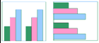
Vertical/Horizontal Bar
|
A vertical/horizontal bar is composed of two or more than two bars. Each bar represents a specific attribute value. The vertical/horizontal bar can be used to compare the values or show the trends. Also, vertical/horizontal bar can be created with other graphs. Bar chart is suitable for displaying the changes of data within a certain period or comparing the values of different features. Graph tool provides vertical bar and horizontal bar. |
* |
* |
* |
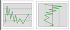
Vertical/Horizontal Line
|
A line graph is composed of one or multiple lines. Line graphs mainly display the trends of values within a continuous scale. This kind of graph can be used with other graphs. Graph Tool provides Vertical Line and Horizontal Line. |
* |
* |
* |
Vertical Area
|
An area graph consists of the lines and area between the lines and X axis. The lines are like Line graphs to present the trend in value, and the areas show the difference of quantities. Area graph can be used with other graphs. |
* |
* |
* |
Scatter Plot
|
Scatter plot graph shows each attribute as a point on the graph to display the relationship between the attributes. You can plot the attributes from more than two fields to create a mixed or overlay graph. Generally, the graph is usually applied to show the data distribution and the comparison of values. |
* |
* |
|
Box Plot
|
A box plot or box-plot enables users to tell symmetry of data distribution and indicate the median obviously. A box plot also distinguishes which observations considered as outliers. |
* |
* |
|
Pie
|
Pie charts consist of a circle or pie, divided into two or more parts. Pie Charts are used to show the relationship between parts in percentage or ratios. Pie chart can display a certain field in a layer, so it is not suitable for creating mixed or overlay graph. |
* |
* |
|


NOTE: There is no fixed principle for choosing graph type. It only depends on what kind of information users want to express to readers. Thus, even the same data can be displayed with different meanings in different graphs.
©2015 Supergeo Technologies Inc. All rights reserved.