
Bar Chart
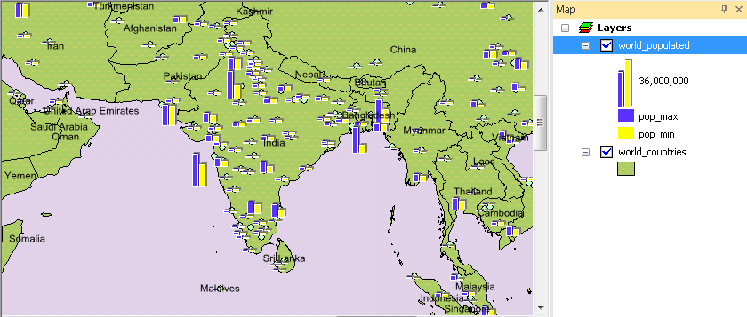
Bar charts can represent the values in different fields of the features of a layer and help users contrast the attributes in different fields. The map below indicates the maximum and minimum proportion in the country.
To set bar chart, choose "Bar Chart" in the "Show" drop-down list in Layer Properties window. Then, select the fields in "Field Selection" and click the button ![]() , and the selected fields will be added to the right column. In "Color" drop-down list, choose the colors for the fields. Also, you can click "Properties" to open "Bar Chart Properties" window.
, and the selected fields will be added to the right column. In "Color" drop-down list, choose the colors for the fields. Also, you can click "Properties" to open "Bar Chart Properties" window.
.png)
In "Bar Chart Properties" window, you can decide the style, orientation, size, etc of the bar chart. 3D "Thickness" trackbar can be used to set the thickness of the Z axis; you can decide whether to display XY axes by ticking "Visible" in "Axis." If you want to edit the style of the axis, you can click "Style" to modify the axis. Furthermore, in "Orientation", you can choose to present the bar chart as columns or bars. In "Size", you can adjust the width, gap, and the maximum height. All of the settings of the bar chart can be previewed at the upper-right corner of the window.
.png)
Moreover, if you have ticked "No overlapped charts" in "Symbology" tab in Layer Properties window and ticked "Leader Line" in "Bar Chart Properties" window, the leader line will appear to indicate the bar charts when the features are too close to display.
.png)
NOTE:Bar charts represent the values in different fields of the features of a layer. You can recognize the values in different field and also compare the values of different features. Normalization drop-down list is for users to choose the field by which they want the value field divide. The results will be classified.
©2015 Supergeo Technologies Inc. All rights reserved.