
Pie Chart
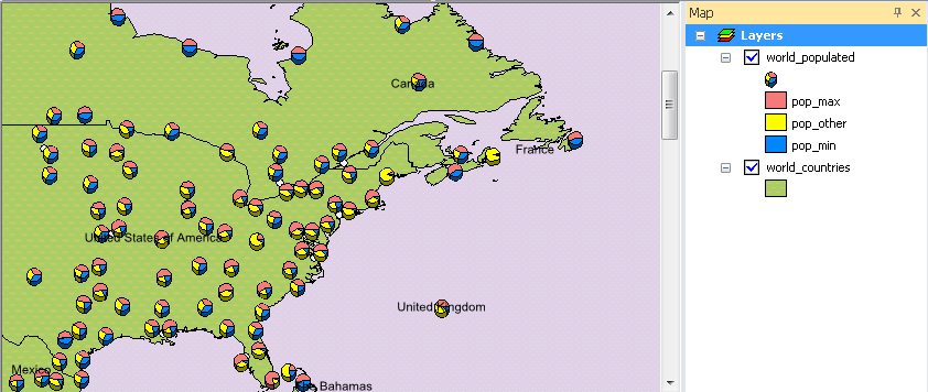
Pie chart allows the several attributes to show in one chart at the same time. Through the pie chart, you can easily view the relationship of different attributes and clearly recognize the proportion of the attributes in the feature. Take the map for example. The pie charts show the percentage of population in different countries.
To set the pie charts, choose "Pie Chart" in "Show" drop-down list in Layer Properties window. In "Field Selection", select the fields you want to show in pie charts and click ![]() . The selected fields will be added to the right column.
. The selected fields will be added to the right column.
.png)
As to the settings of pie chart, you can click "Properties" button to open "Pie Chart Properties" window. You can use the "Tilt" trackbar to adjust the angle of the Y axis of pie chart. The thickness of the pie chart can be adjusted by "Thickness" trackbar. You can choose "Geographic" or "Arithmetic" for the orientation of the pie chart. To set the size of pie chart, you can choose "Fixed size", "Vary size by the sum of the field values", or "Vary size by a field." Fixed size means the size of the pie chart is fixed no matter what the volume it presents. If you choose Vary size by the sum of the field values, the size of the pie chart is decided by the sum of the values of the assigned fields. Meanwhile, you can assign the maximum of the size. If you choose Vary size by a field, the size of pie chart is varied by the value of the assigned field. As all the settings are finished, click "OK."
.png)
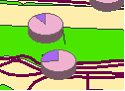
If you have chosen No overlapped charts in "Symbology" tab and ticked Leader Line, the Leader line will be used to indicate the pie charts when the pie charts are too closed to display.
NOTE: In selecting fields for pie charts, you can use the button ![]() to add all the fields; If you want to remove the field, you can click the button
to add all the fields; If you want to remove the field, you can click the button![]() . Or you can click
. Or you can click![]() to remove all the fields.
to remove all the fields.
©2015 Supergeo Technologies Inc. All rights reserved.