
Graduated Color
When you need to display the map quantitatively, you need to choose graduated color or graduated symbol to classify your map. The former uses different polygon symbols to present different attributes, and it is called graduated color map. Graduated Color is to use a series of colors to stand for the values in different ranges. Generally, the attributes are categorized by ranges, such as 0-5, 6-10, or from the lowest to the highest. Therefore, the classification method is only suitable for numeric field. The following map is the geology classification map of Northeast Coast of Taiwan. Each color presents a range of layer count. The deeper the color is, the more the layers are. Each range contains 10 layers and is presented with a color.
_new.zoom49.png)
To set the graduated color, choose "Graduated Color" in the drop-down list in Layer Properties window; then, graduated color settings appear. You can choose the field for classification and decide whether to use Normalization drop-down list. You can choose the filed for Normalization with which you can normalize the values in "Value Field"; the results will be classified. The item is optional (the default is none). For example, if you want to calculate the population density, you can choose population in "Value Field" and choose area in "Normalization." As a result, the system will divide the population by area, and you will get the population density. The results will be classified. Moreover, you can decide the classification classes in the Classes drop-down list (you can enter the value directly as well). In "Color" drop-down list, choose the gradient colors you need. The range of the classification can be modified; users are allowed to double-click the "Range" column and enter the value to modify the maximum of the range. Take the first row of the table for example. The original range is 63~73; if the range is modified as 63~83, the second row will be 83~95. So, the problem caused by range modification can be prevented. The "Label" column next to "Range" can be modified in the same way, but the modification only affects the display in "Data Content" rather than the range of classification.
.png)
Note: The button ![]() enables users to open Symbology Selector window and set settings like style, size, and outline width of all the symbols or the symbol type you specify (symbols can be multiply selected through Ctrl key). However, users are not allowed to modify color of single symbol through function of the button. Users can utilize the drop-down menu of Color to modify color of all symbols or double-click on a certain symbol to set its color.
enables users to open Symbology Selector window and set settings like style, size, and outline width of all the symbols or the symbol type you specify (symbols can be multiply selected through Ctrl key). However, users are not allowed to modify color of single symbol through function of the button. Users can utilize the drop-down menu of Color to modify color of all symbols or double-click on a certain symbol to set its color.
After the number of class is set up, click “Classify” next to “Classes” and the “Classification” window shows up. Six methods for classification: equal interval, quantile, standard deviation, natural breaks, defined interval and manual.
Equal interval is to subtract the minimum from maximum so the result will be the range of the classification. According to the count, the range is divided to equal interval. It is probably best applied to rainfall, temperature, air pollution, etc.
Quantile is to arrange all the records in order and divide them equally based on the specified number of class.
Standard deviation refers to the standard deviation calculated by system; users can select the ratio of standard deviation in “Interval”, the smaller ratio leads to the smaller interval.
Natural Breaks aims to minimize the difference of values in the same group, while maximize the difference of the values between different groups.
Defined interval allows users to define the interval on their own. Users can enter the number of interval after selecting the “Defined interval.
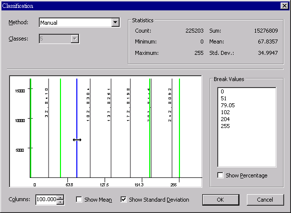
Manual enables users to decide the break value. Users can directly input the “Break value”, as the interval is changed, “Method” will switch to “Manual” automatically.
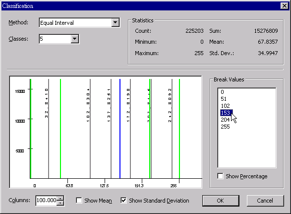
In the “Classification” window you can change “Classes” as required. The “Statistics” will show the statistic data including count, minimum, maximum, sum, mean and standard deviation. “Break value” is calculated using the current assigned method, number of class and interval. See the histogram below, the green lines represent the interval; when the interval value in the right side is clicked, the green line in the histogram will be selected and displayed in blue line. Checking “Show Percentage” below, the break value will show the break value in percentage.
Below the histogram are “Show Mean” and “Show Standard Deviation”; if they are checked the gray lines which respectively indicate the positions of mean and standard deviation will show up. “Columns” is adjustable, ranging from 1 to 1000.
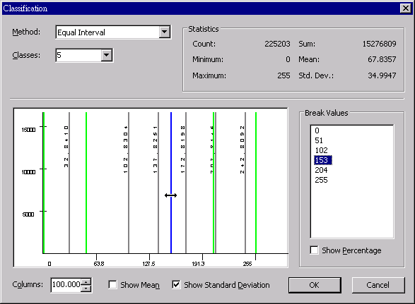
In addition to editing the break values manually, users can click the green break value line and drag it directly to the position required; in the meantime, the break value shown in the right side will change along and “Method” will automatically switch to “Manual.” See the figure below, after the break value line is selected and moved to the left side, the break value has been changed and resorted.
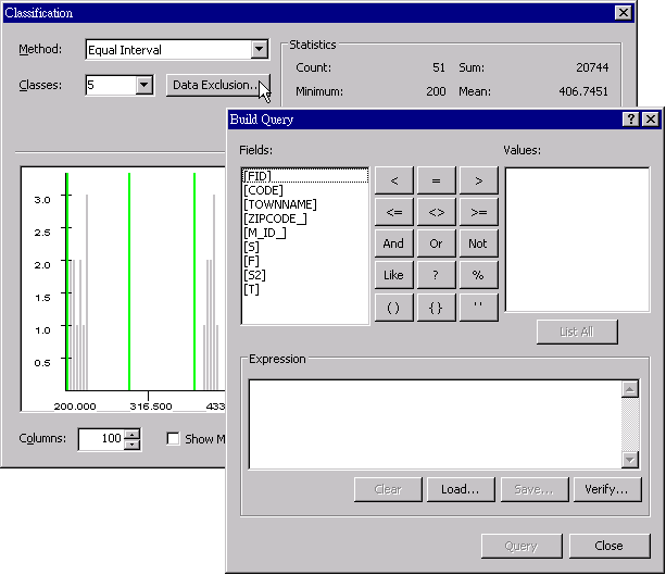
“Data Exclusion” is used to exclude all the data that meets the expression result. That is to say, data meeting expression result will not be included in the classification and the chart.
When all settings are finished, click “OK” to complete the graduated color setting. As to the manipulation of other function buttons in this tab, please refer to the description in “Unique Values.”
Note: The button ![]() enables users to open Symbology Selector window and set settings like style, size, and outline width of all the symbols or the symbols you specify (symbols can be multiply selected through Ctrl key). However, users are not allowed to modify color of single symbol through function of the button. Users can utilize the drop-down menu of Color to modify color of all symbols or double-click on a certain symbol to set its color.
enables users to open Symbology Selector window and set settings like style, size, and outline width of all the symbols or the symbols you specify (symbols can be multiply selected through Ctrl key). However, users are not allowed to modify color of single symbol through function of the button. Users can utilize the drop-down menu of Color to modify color of all symbols or double-click on a certain symbol to set its color.
©2015 Supergeo Technologies Inc. All rights reserved.